Dejavoo Rebrand
Who is Dejavoo? Dejavoo, part of iPOS Systems, designs payment processing terminals and POS software for businesses of all sizes, from countertop and PIN pad terminals to Android-based registers. Their hardware powers secure, EMV-certified transactions for retailers, restaurants, and service businesses across North America.
My Contributions - While working at Kreber, I was one of a handful of designers brought onto the Dejavoo account to pitch a new logo as part of the brand’s full rebrand. My direction was the one selected, and from there I helped shape the new look and feel, building out a starting set of brand assets the Dejavoo team could carry forward on their own.
Before the rebrand, Dejavoo’s identity was scattered. The old logo mixed a handful of mismatched icons, and several sub-brands under the Dejavoo name had no clear visual relationship to each other or to the parent brand. Nothing felt connected.
The new mark was built to solve that directly. The icon hints at two points linking together, a nod to the connectivity at the heart of how Dejavoo’s hardware and software work in tandem. We paired it with a bold purple, a deliberate choice to help Dejavoo stand out in a financial space crowded with blues and greens.
TLDR: Logo design and brand identity pitch, color system, and a starter asset kit for rolling the new look out across sub-brands
Current
Previous Identity
Before the rebrand, Dejavoo’s branding didn’t have one voice, it had several. The logo paired a heavy wordmark with a mismatched icon, and color treatments shifted depending on which asset you looked at, sometimes blue, sometimes a muted grey-purple, sometimes flat black. None of it pointed back to a single identity. Stack the sub-brand logos on top of that and the inconsistency only got louder. Before any new design work started, it was clear the fix needed to begin at the type and color level, not just a new icon.
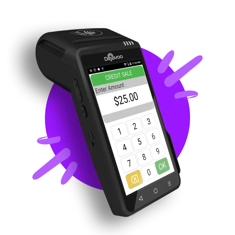
Payment Machines
The new identity needed to hold up on the actual hardware, not just in a slide deck. We carried the new mark, color, and type system onto the devices themselves, applying the logo to the physical terminal and bringing the same look into the on-screen interface customers see during checkout. Seeing the rebrand live on the machines was the clearest proof that the new direction worked end to end, from a sell sheet down to the screen in someone’s hand at the register.
TLDR: Logo and brand application across physical terminal hardware and on-device screen UI.


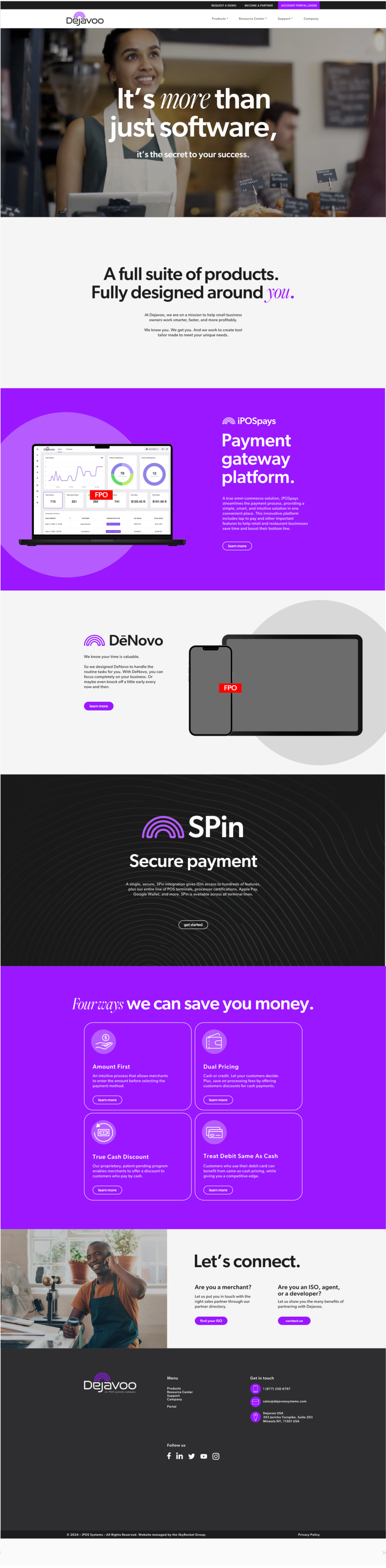
Website Wireframe
To show Dejavoo what the rebrand could grow into beyond the starter asset kit, I put together a wireframe for what their website could look like under the new creative direction. It wasn’t a finished site, just a clear outline of layout and hierarchy showing how the new logo, color, and type system could carry across a full web presence instead of staying limited to print and social

Sketches
I don’t usually show the behind-the-scenes side of a project, but this one’s an exception. A lot of the hand-drawn identification marks you’ll see throughout the Dejavoo brand came directly from my own hand and pen, not a vector tool. Sharing the sketches felt right here since they’re as much a part of the final identity as anything built in software.